BLOGS
Color Trends for Your Italian Inspired Home
Another year have just approached and most of us have been coming up with our list of new year’s resolution. Resolutions and goals for a happier and better year ahead. Some of us may have travel plans, new career goals, some may be looking over into buying a new house and lot, a car, a new gadget, and other big life decisions.
While some people are focusing on short term or simpler goals such as losing weight, getting a new hobby, starting a journal, or remodeling and redesigning their rooms or houses. What other way to get a good and fresh start for your 2022 than by redesigning your humble abode.
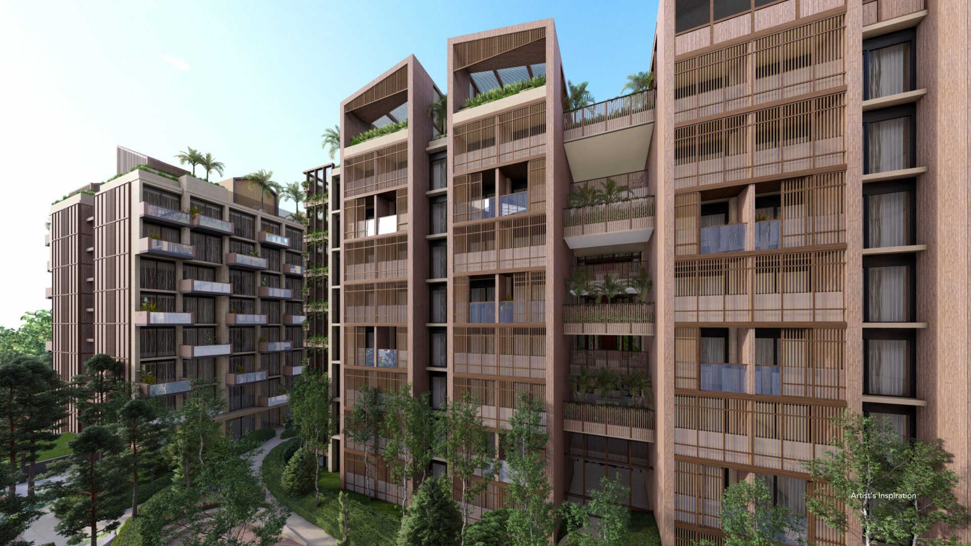
In Portofino Alabang and in most luxury house and lots in Daang Hari subdivisions, exterior designs are mostly fancy and grand. Aside from getting a nice house, one should also consider other factors such as the theme, and the color of the community as a whole.
In Vista Alabang, most of the houses and establishments are patterned and designed after Italian architecture. From the castle type houses like Ghiberti, even to its malls and community spaces. It really screams luxury.
Starting afresh as the new year approaches and as we shift over to the post-pandemic phase, most people are still leaning over the feels for a vacation or hotel like homes as there are still restriction and limited access for travelling.
Interior design has been such a big deal now considering that we are all staying in our homes a little longer than in the previous years of pre-pandemic.
Some houses are also still in their holiday motifs as we are still figuring out the right and trendy theme to go for this 2022. It would be a good idea to repaint your walls or score some accent pieces or linens to get the vibe right.

One best thing about colors is that it really pulls off the vibe, emotion and personality that we may want to portray. It has a very powerful influence in the interior designing. In figuring out your new set up, there are several color trends that we can try.
“Paint trends will fall into two distinct camps this year: those who are seeking reassurance from nature and are choosing earthy, organic shades. Think olive greens, sandy neutrals and clay-toned terracotta shades. This kind of desert palette shade that always looks luxurious and comforting, whether on walls or textiles. On the other hand, lots of people are leaning towards the kind of vibrant, energizing and exciting hues, which were popular in the ’50s.” — Annie Sloan
-
Veri Peri
Awarded as The Pantone Color of the Year, Veri Peri gives off a lively periwinkle blue hue with a violet-red undertone. They say that this color depicts a joyous vibe and may require people to be bolder and braver as it isn’t really a color most of us are comfortable with.
It is far from the usual neutral color trends and may give you a chance to play with it. It goes well with other pastel colors and yellow toned palette. It is very eye catching and can be an accent to your present and existing neutral toned materials and finishes.
Veri Peri as it is a very versatile color, it can fit well in different types of décors. You can buy some art paintings, a vase, pillow cases, linens, carpets, or curtains. But to also be conservative in buying new decoration materials, an accent wall with this color would also be a good idea.
-
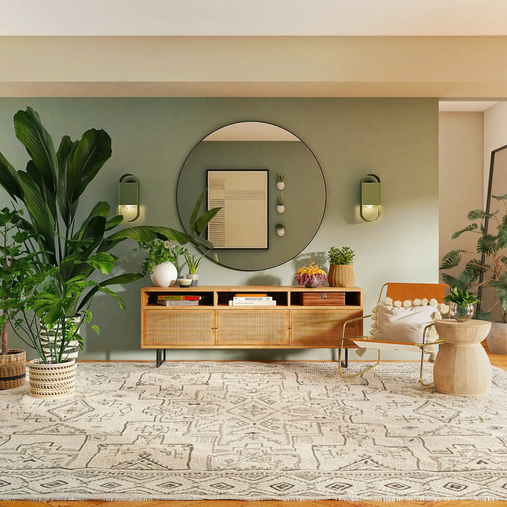
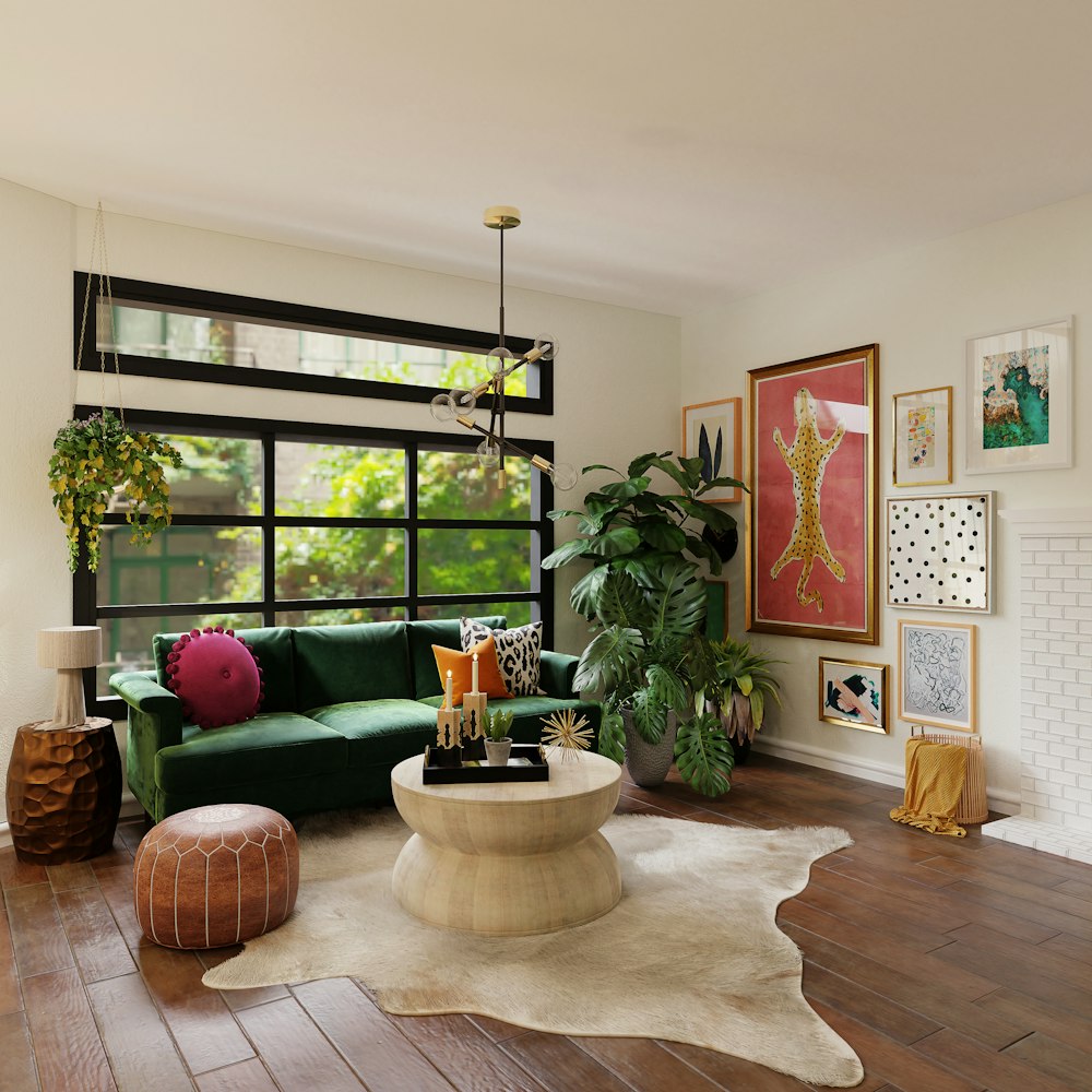
Evergreen Fog
For Sherwin-Williams, this is the Color of the year. It’s very calming and earthy tone is what makes it such a nice color to go with your interior. It is a mix of green and gray which very well match your neutral toned or white walls, furniture, and fixtures. It is very sophisticated yet very subtle in the eyes.
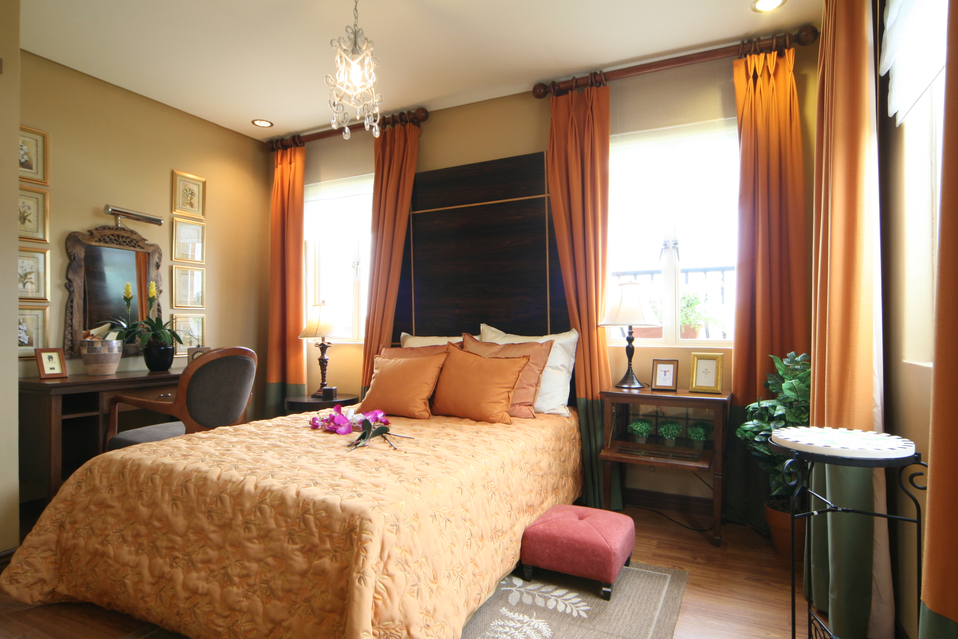
It goes well with brown and wood designs which for a fact became a very famous accent in houses and rooms in the past years. Teal color gives off a vintage elegant vibe that matches Ghiberti model and other Italian inspired homes and luxury house and lots.
Amore at Portofino by Brittany Corporation Van Gogh Inspired Interior | Photo from Brittany Corporation
-
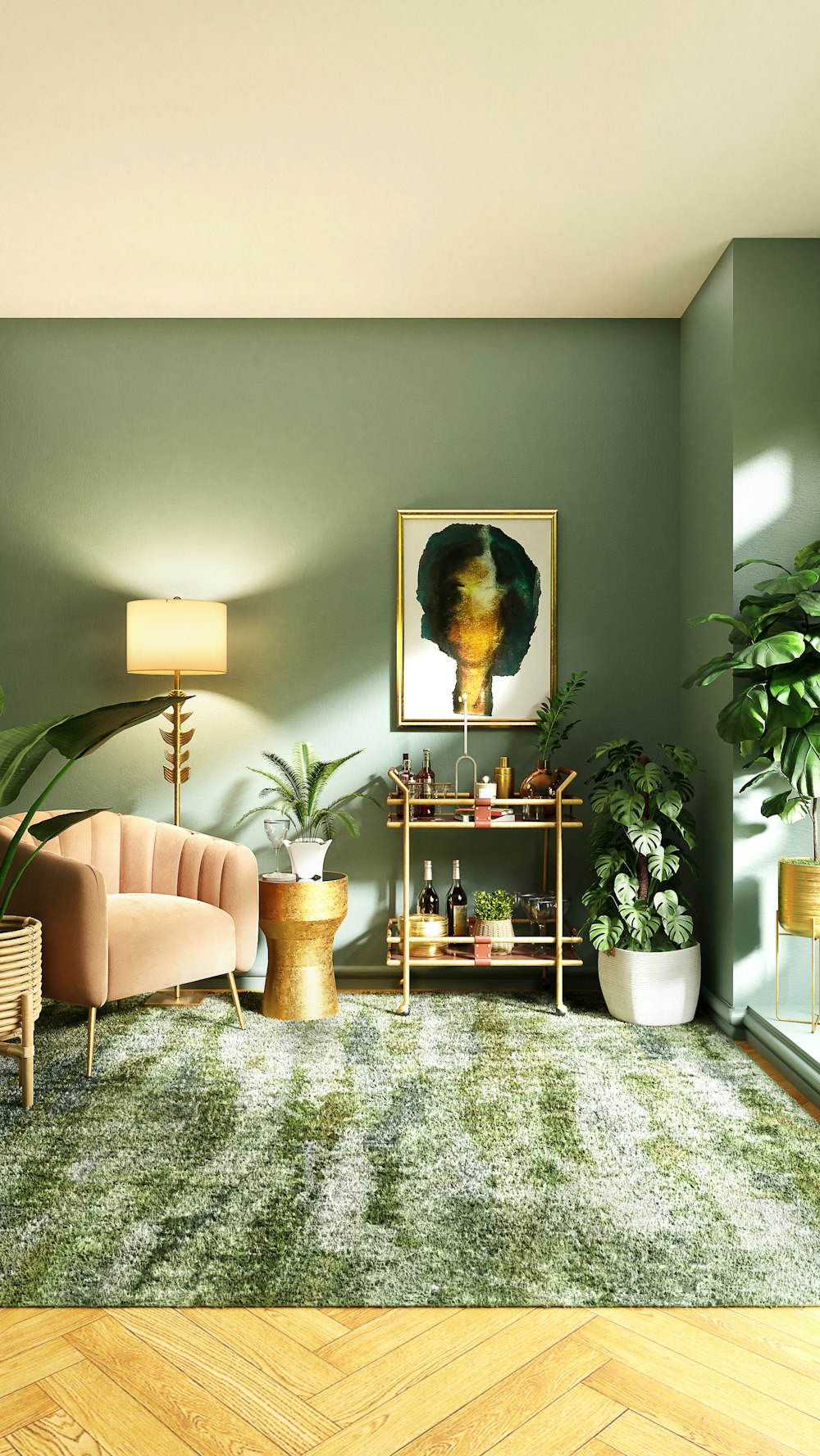
Terracotta
This color blends the best with the house and lots in Portofino Alabang as it is a color that is very close to rustic and warm. It is lively and pleasing to the eyes. For Italian inspired homes, this color is very popular. It is also a bright color that is very easy to pair with. It goes well with browns, whites, or extreme colors like royal blue and green.
It is a color we can associate with bricks, clays, and earthenware and have been adapted over time. It always comes back as a color trend because as same as Portofino Alabang, it gives off the vibe of timelessness and elegance. It is also a nice choice to choose a color that also agrees with the theme of your house.
The communities in Vista Land are well known for its Italian inspired homes which would go well with earthy tones such as this color.
Amore at Portofino | Photo from Brittany Corporation
-
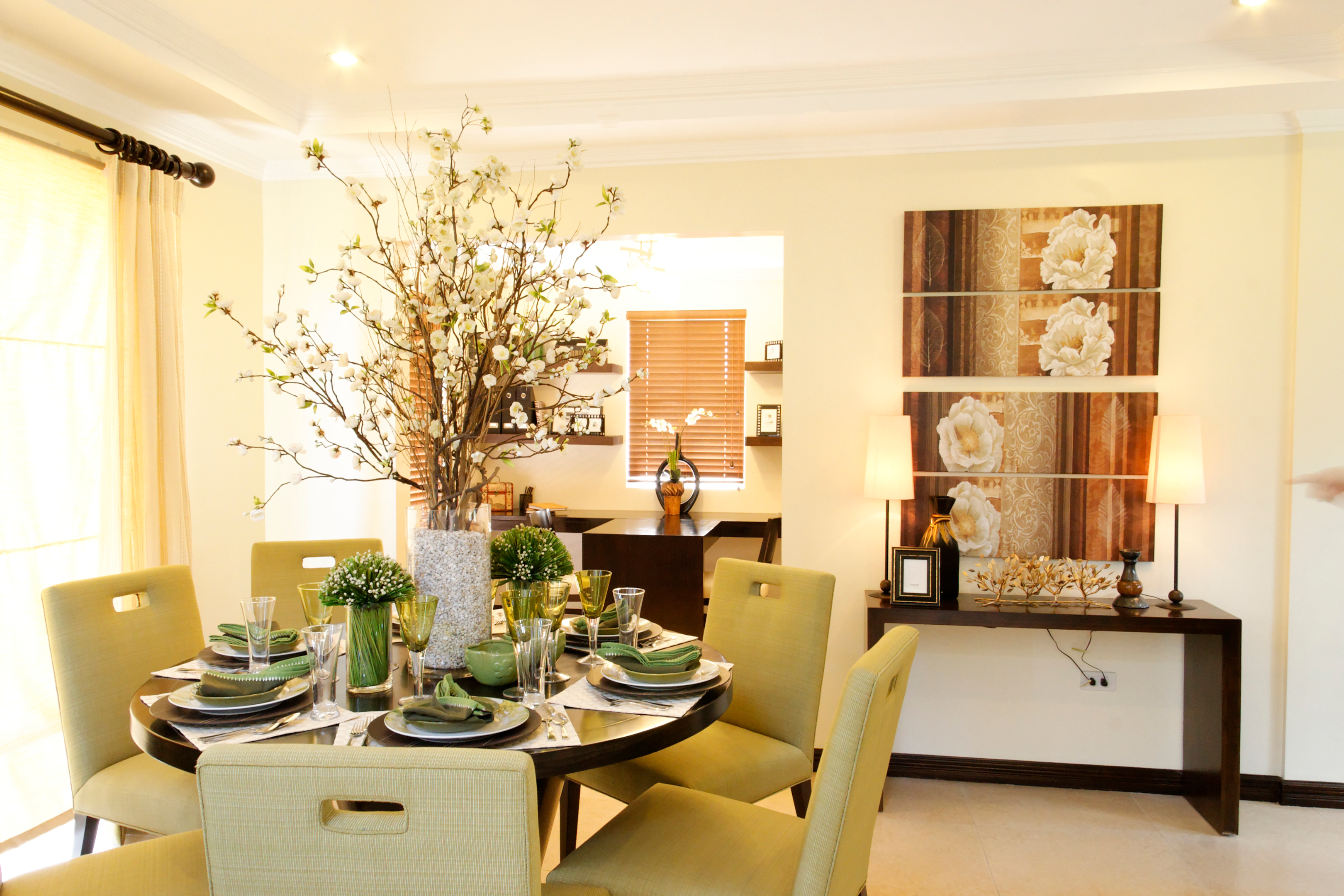
Cream and white
A color that was never old fashioned. It goes well with almost all color trends. This color is easy on the eyes, calm, yet is very sophisticated. Houses in Amore at Portofino that portrays rustic appeal of Tuscany that gives off neutral and earthy tones that may be best with cream and white.
These two colors when blended together makes a room lighter and airier yet elegant and clean. White colors also illustrate an illusion of making a room look even bigger and less humid. You can never go wrong with white as they say “Simplicity is beauty”.
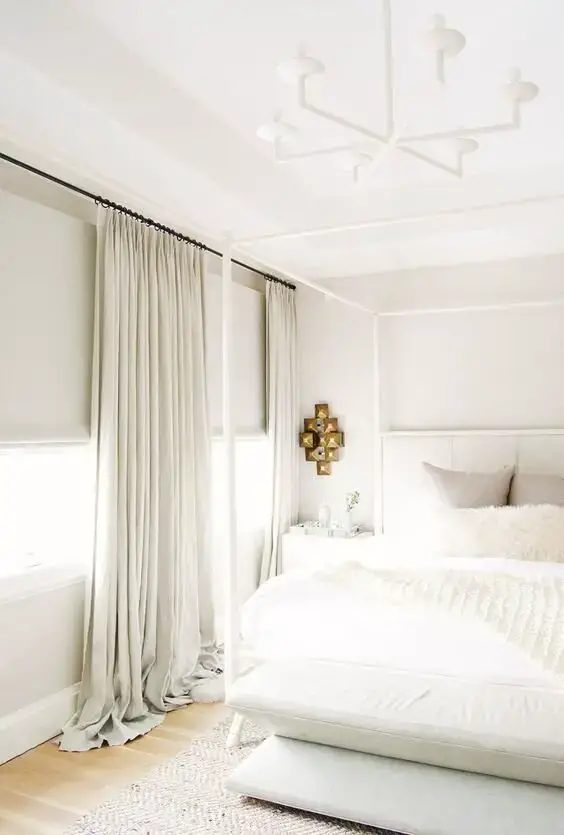
5 Tips For Decorating with Different Shades of White & Cream | Photo from Savvy Heart
-
Neutral Colors
You could go big and bold with the colors you’ll choose for the theme of your house this 2022. But going with Neutral colors such as gray-toned colors, nudes, beige, taupe, and such, is still one of the best and safest choices.
Most of the big furniture that we buy may already be in these colors and buying new ones may be a little risky considering that it is the start of the year. As we are all spending most of our times inside the house now due to the Covid-19 restrictions, we all want our homes to be as comfortable, as light, as it can be.
It makes the area look a bit minimalist and aesthetic at the same time. While it is nice to have pops of color in your house, going with neutral colors are also good to stick with. You never grow tired of it and it works for any styles that you might think of and wanted to suddenly shift to on other special occasions.
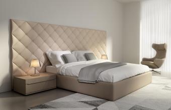
8 Ways to Use Neutral Color Palettes in Interior Design | Photo by Love to know
There is a long list of color trends that you can go with and these are just a few of them. There are countless of colors that could go well with your Italian inspired home to make it look more luxurious. But the thing with interior design is that it is limitless, it depends on whoever would be using the space and living in it.
The colors that you will use doesn’t have to be limited to just neutral ones, to warm ones, it could be anything you want as long as it is pleasing to your own eyes. Colors can definitely portray feelings, emotions and personality so it is only vital to choose the right one for your own home.
To be able to live in a comfortable yet elegant and stylish home.
Having to own a luxury house and lot in metro manila and to be able to live in a relaxing and comforting home. This has been the goal for most of the people for themselves and their families. So even that littlest and tiniest detail is important when deciding what to buy, where to put it, what color to go with.