BLOGS
The Color Palette of Luxury
Color palettes or the best color combinations are one of the fundamentals of home decoration. It is among the five basics of interior design. That is because color combos are one of the easiest ways to influence how you look and feel in spaces. It feels like it is your brand identity. Whether you are going for a room with bright colors or a neutral one; or something with just primary colors or something more vibrant, brand color helps set the tone for a space and influences its design style.
A well-executed color scheme has the potential to make a space appear larger, cozier, and more refined. The use of the appropriate color scheme in the appropriate locations is a component you will want to think about when designing your living environment, regardless of the emotions you hope to elicit there.
This blog spot has compiled a few thematic color palettes from leading real estate brands such as Brittany in order to assist you in navigating the correct color combination for your home design. Additionally, some tips and inspirations on how to choose the appropriate color schemes for your most comfortable luxury living have also been included. Ready? Let’s begin.
The Primary Brand Color of Brittany
For luxury real estate investors and home buyers, color combination is a predominant feature to look for when selecting a prospective house. Some high-end home buyers can be particularly picky about certain details like the color scheme of a house and lot for sale. Hence, competition in the real estate market in the metropolis is seriously intense.
Architects and designers are, therefore, challenged to constantly refine their ability to make good use of the natural colors of landscapes on luxury lots to boost sales and buyers. In a sense, the luxury color palette is becoming more and more of an earmark for top brands in the industry.
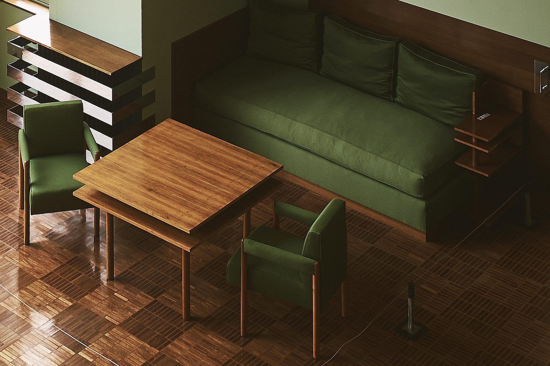
The color palette is one important decision you will need to make for your home design. Though the best way to set a color palette in a home is through the use of paint colors; textiles, as well as decor, art, and even upholstery, are pieces that can also help establish and support the color palette in spaces.
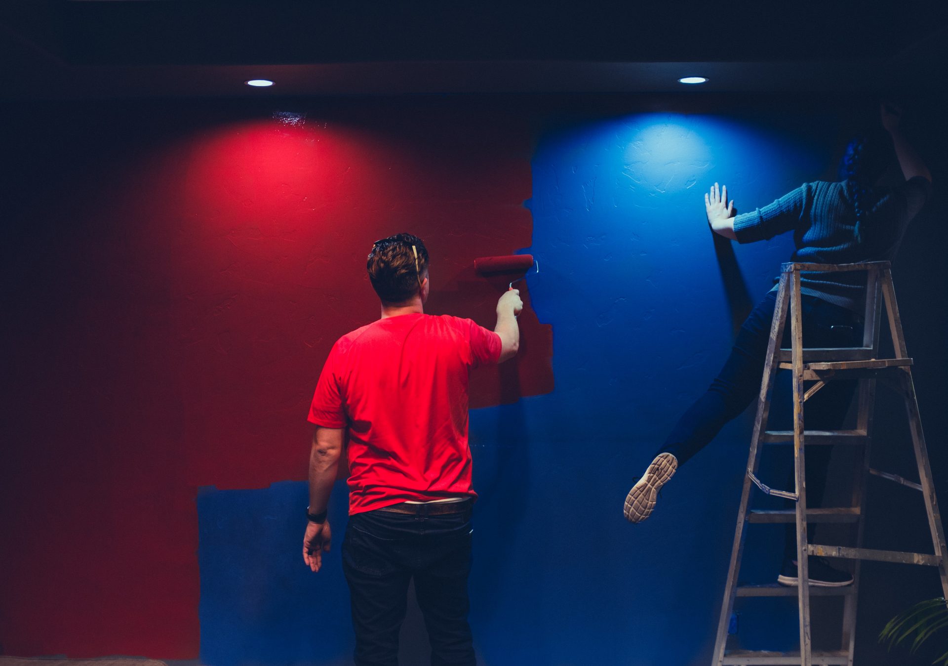
The color wheel helps a lot in the arrangement of the right color combinations for your home. A perfect color palette can make a big difference in everything from paint colors to fabrics and finishes.
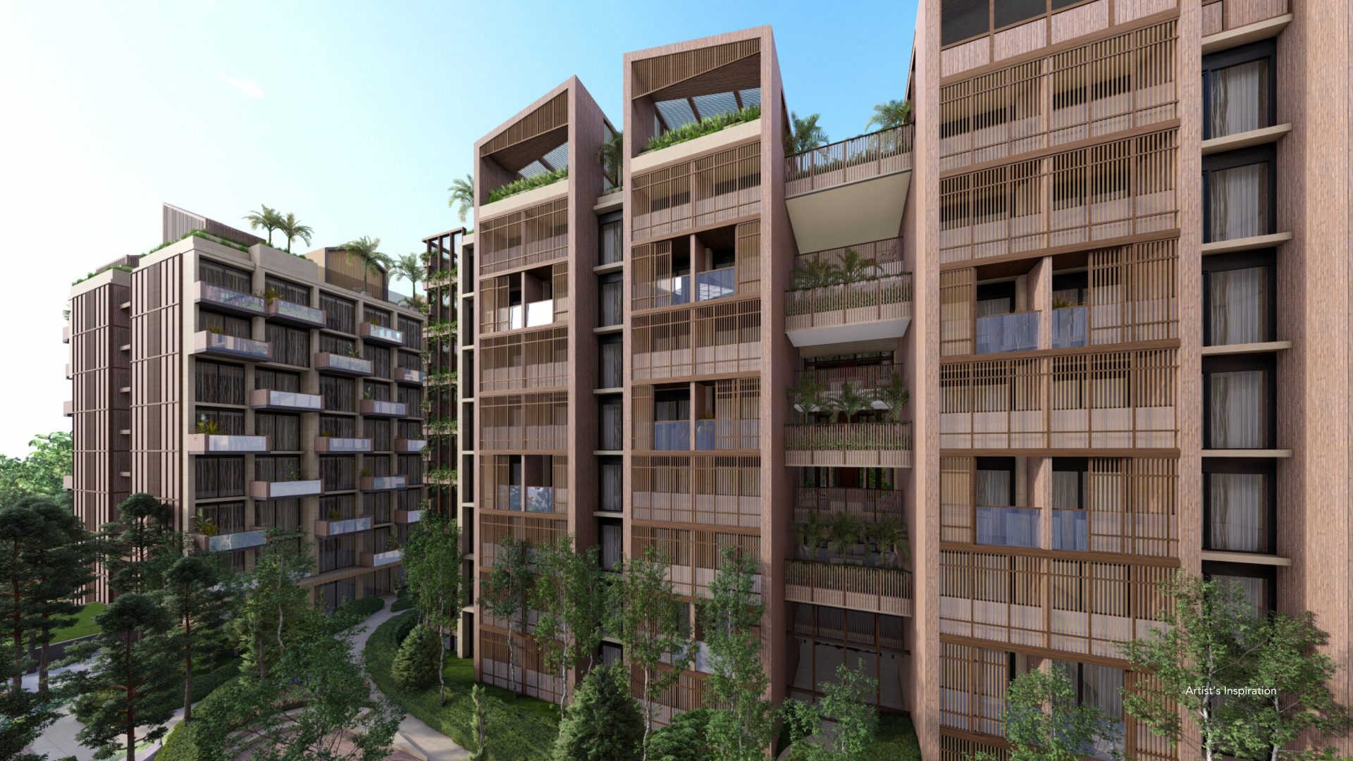
As the top developer in the luxury real estate industry in the Philippines, Brittany is highly acclaimed not only for its world-class themed communities but also for its luxurious color palettes on its themed luxury houses for sale.
Accentuated with the finest designs based on the world’s most visited tourist destinations, Brittany’s top-notch luxury houses and lots in Metro Manila in Daanghari subdivisions boast stunning color combinations that radiate comfort, allure, and luxury.
Brittany’s brand colors have helped it become one of the most sought-after providers of luxury homes in the country. Brittany’s offerings include world-class Italian-themed luxury houses, Swiss-inspired premier homes with bright color finishes, and old-fashioned American-styled luxurious residences. All of these homes are straddled with classic world charm and modern design.
Luxury Palettes: Colors of Italy
Portofino Alabang is one of the loftiest luxury house and lot developments in Brittany. With Italian architectural details and design such as cobblestone pathways, gabled roofs, cupolas, and a pocket garden, it exudes beauty and elegance and offers remarkably striking luxury houses and lots for your family.
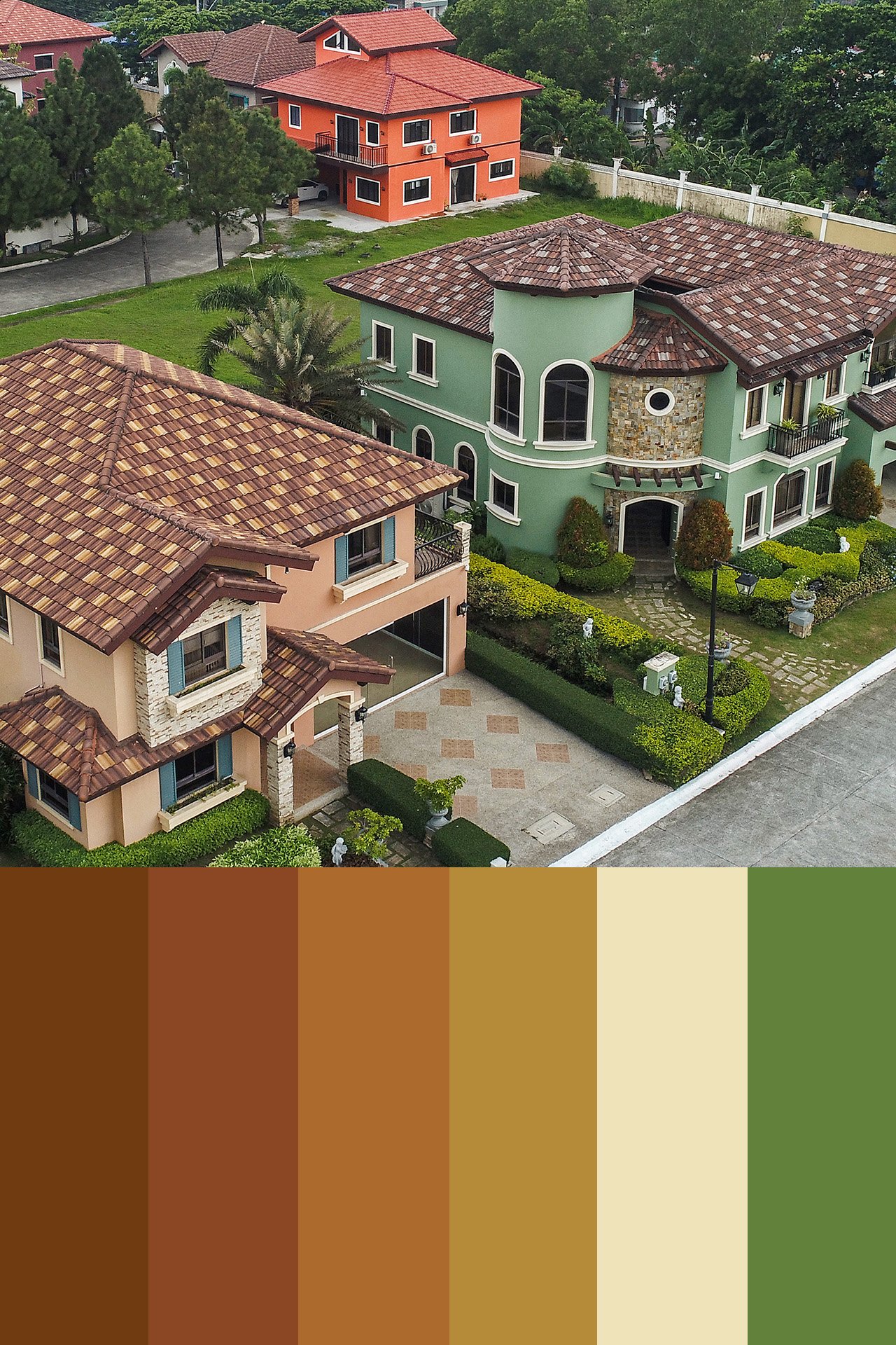
Ensconced in an expansive 75-hectare enclave, Portofino’s architectural design and color scheme are an emblem of classic Italy. Its combination of colors, from outdoor entertaining spaces and landscapes down to its interior designs, is a sight to behold.
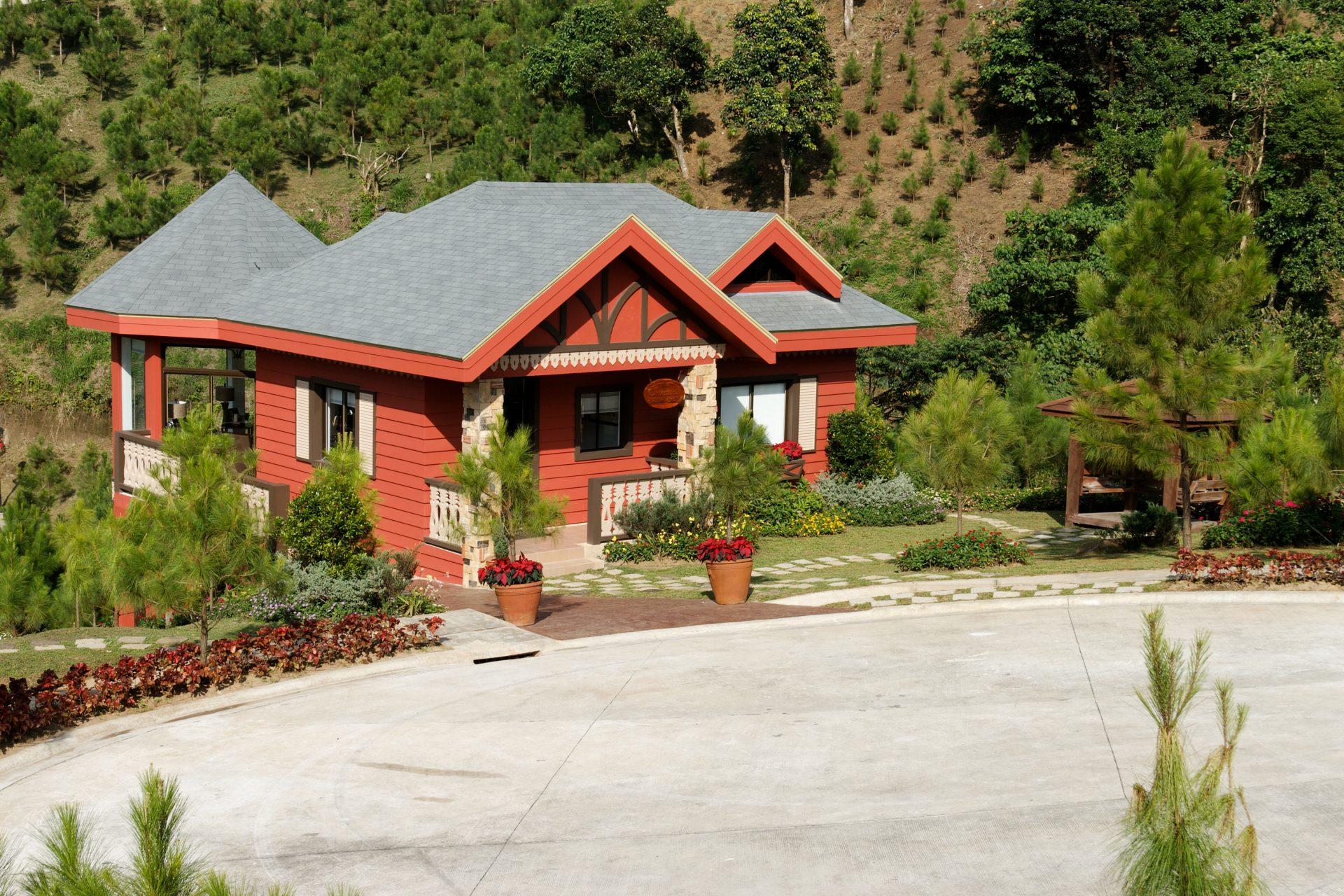
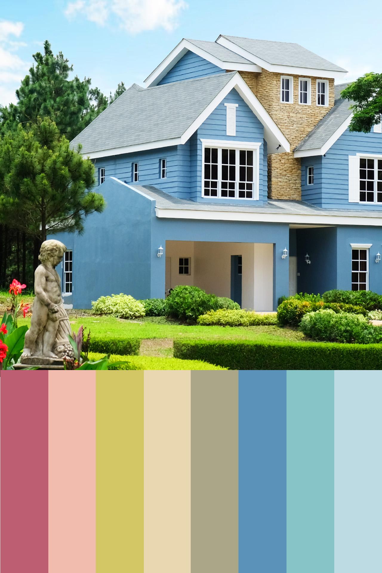
Italian homes like those in Portofino use the brand colors of saturated orange, dark green, lime, and sometimes light blue. To add sophistication, you may as well add the colors of cream and white on fabrics or inner walls, along with neutral and earthy tones to give off a homely atmosphere.
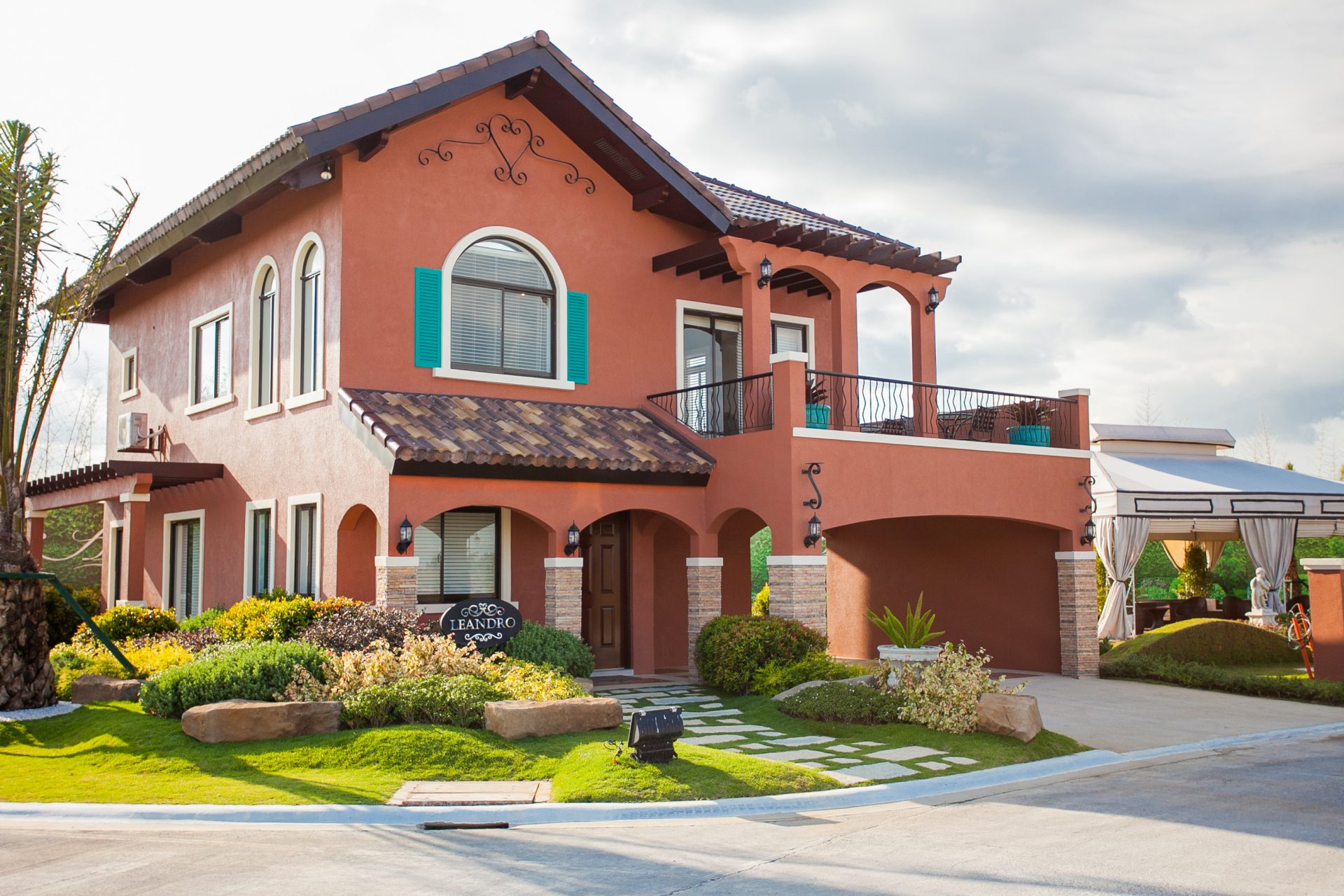
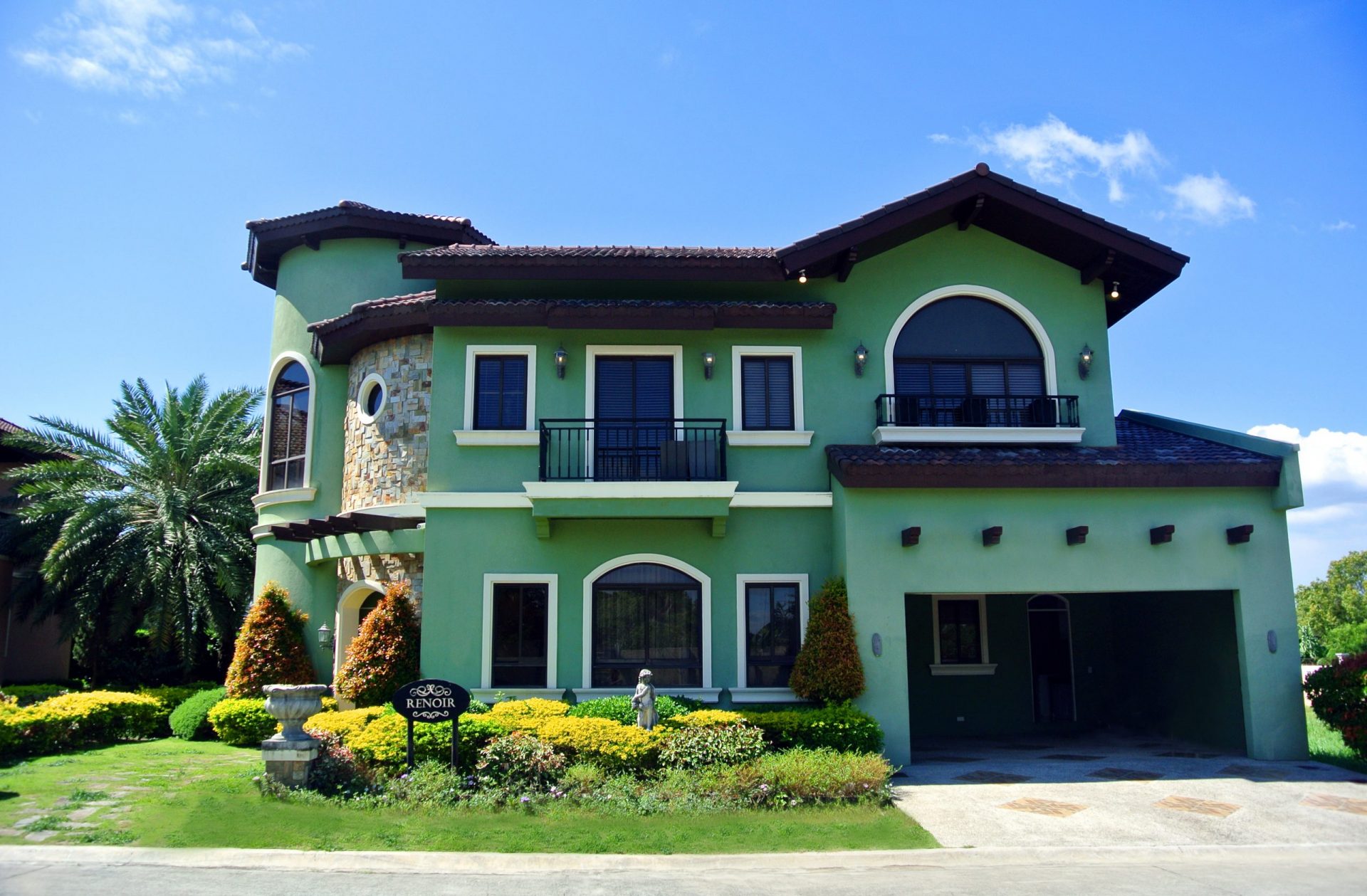
The terracotta color also blends well with any of Portofino’s luxury houses since it emanates simplicity and exudes a feeling of warmth. It is popular among Italian homes because it goes well with the hues of brown, white, and even extreme colors like navy blue or dark green.
Achieving the perfect Italian luxury color palette for your home can be tricky. But with a little help, you can get it just right. The key is to choose a color that complements your other home furnishings and décor. After all, you want your home to reflect your unique sense of style. To find the perfect luxury color palette for your home, consider using a color wheel.
This tool will help you determine which colors work well together. You can also ask an expert for advice. Once you’ve chosen the perfect luxury color palette for your home, be sure to test it out before making any final decisions.
This way, you can see how the colors look in different lighting conditions and make adjustments as needed. With a little effort, you can achieve the perfect Italian luxury color palette for your home.
Luxury Palettes: Colors of Switzerland
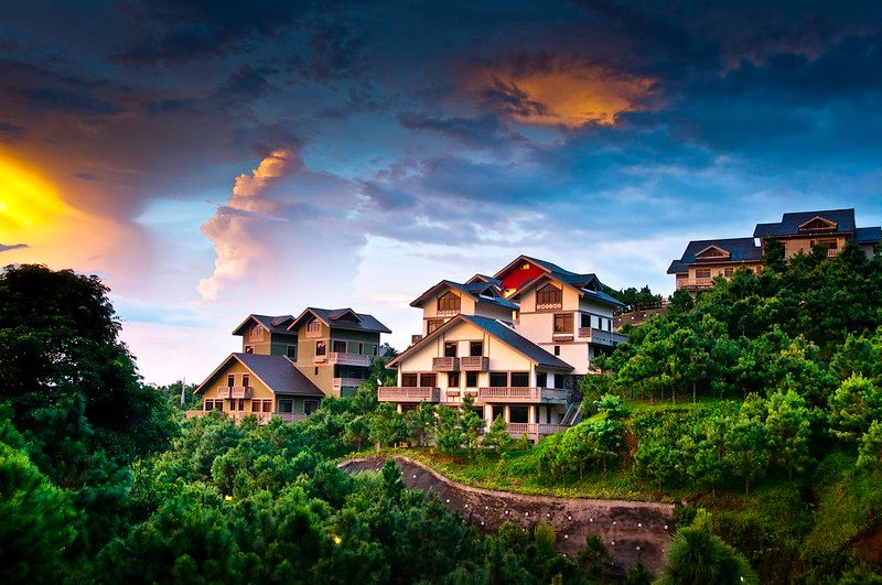
Another themed luxury lot development in Brittany is its Swiss-inspired community, Crosswinds. Coupled with its lush flora, Crosswinds in Tagaytay is a world of its own with its ready-to-move-in luxury homes like Chatelard and Lucerne. These luxurious homes bask in the beauty of hues that perfectly complement a Swiss-inspired lifestyle. To optimize the Swiss experience in a Swiss chalet of Crosswinds, most homeowners pay attention not only to colors that evoke cozy charm but also to upholstery and other home decorations that complement them.
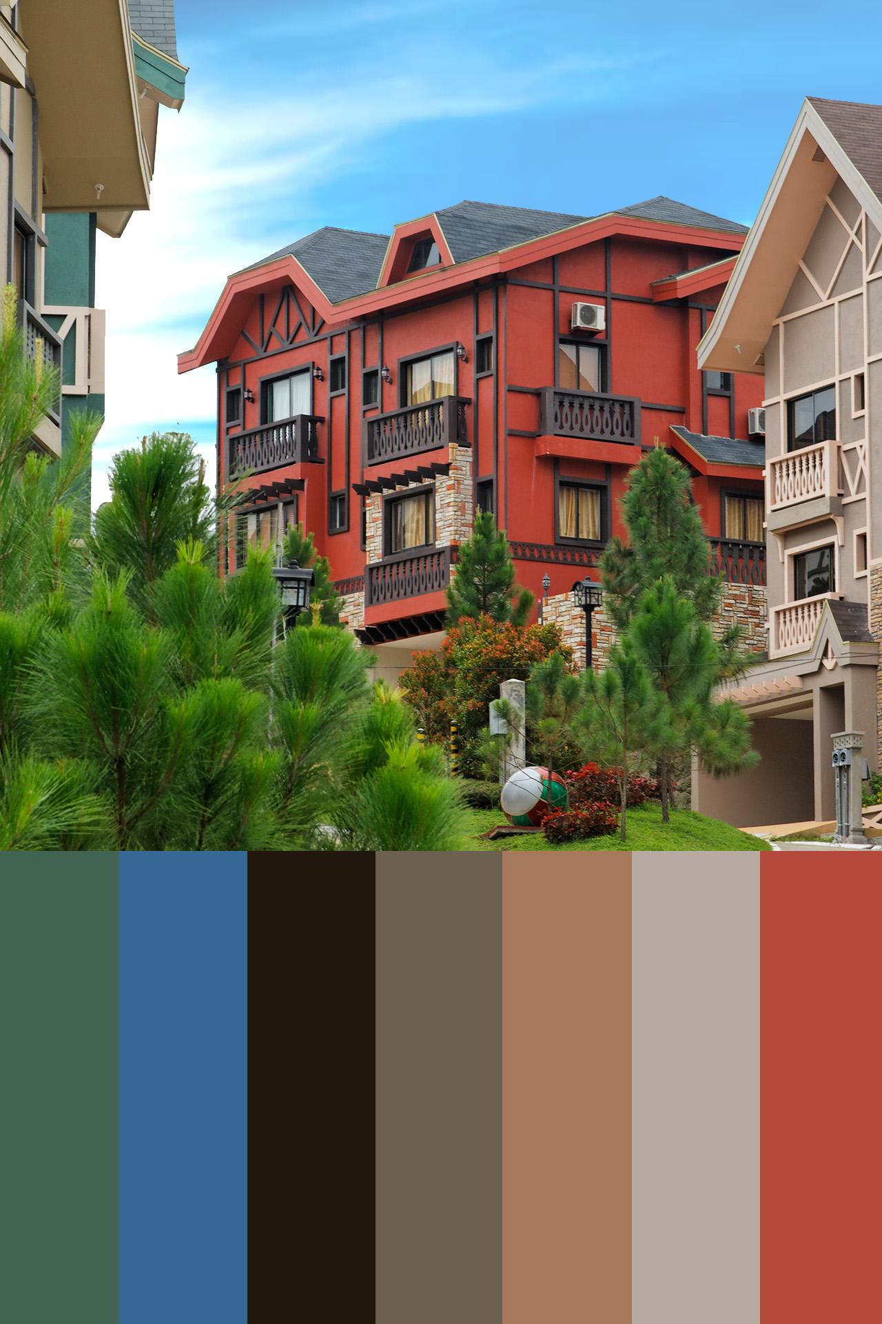
Although most Swiss-inspired chalets today are modernized already, the distinct touch of nature and essential charm are still present. The Chatelard of Crosswinds Tagaytay is one of the aesthetic designs of a modern chalet with superb craftsmanship.
It is accentuated with asphalt shingles with roofing insulation, plastered walls, and partitions in the paint finish, and a couple of woodworks like stair treads, handrails, balusters, and cornices and baseboards to keep the vibe of nature within reach.
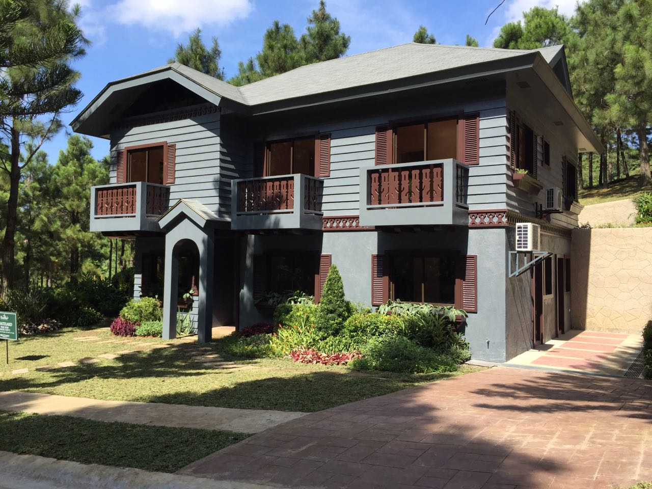
Other than the slew of woodwork in the interior, Crosswinds brand color perfectly highlights the Swiss Alp experience with its neutral tones and sometimes tinges of navy blue or light blue to bring in the clear skies outside. The natural dark green color of pines in its surrounding landscape only serves to make Crosswinds more naturalistic and inviting.
Of course, the architectural design and structure of Swiss-inspired luxury homes will be more than just any typical luxury house if you make it into a livable work of art by blending the right colors in the right places with the right furniture and finishes. Crosswinds is highly advanced in exploiting the right combination of more colors in spaces to underline spaciousness and balance.
Luxury Palettes: Colors of Old America
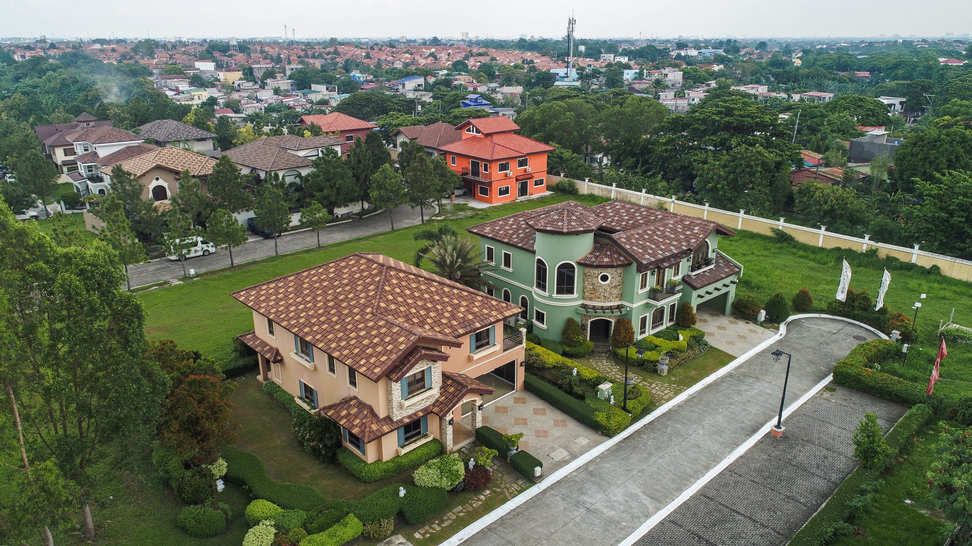
For homeowners who are thrilled with exploring and experiencing historical design points, especially those of the classic period, this particular home design may be your next home choice. Brittany’s luxury homes in Sta. Rosa is a prominent residential property that gives off the old-fashioned vibe and nostalgia of neoclassical home traits.
This style of luxury house and lot in Brittany is sprawled in communities where nature feels closer than ever, with manicured outdoor spaces and covered porches wrapping the house. Thanks to many family-friendly TV shows that often show living in a classic American style, the color palette of the old-world English style has become one of the popular choices among families.
These themed luxury homes are painted with neutral tones of the color wheel, mostly with bright brand colors of cream and white, rust and white, navy or royal blue and white or cream or beige, and saturated orange to effectuate the timeless grandeur of stately mansions in the 1800s.
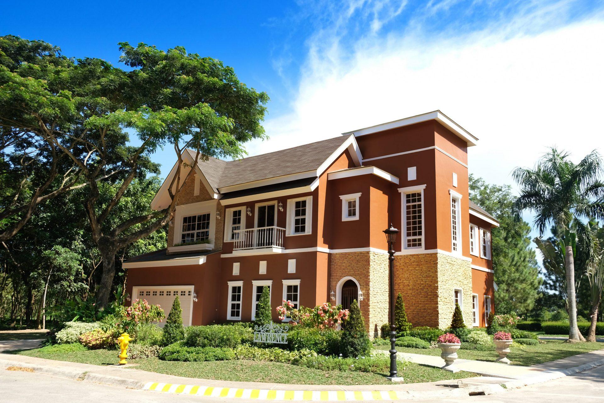
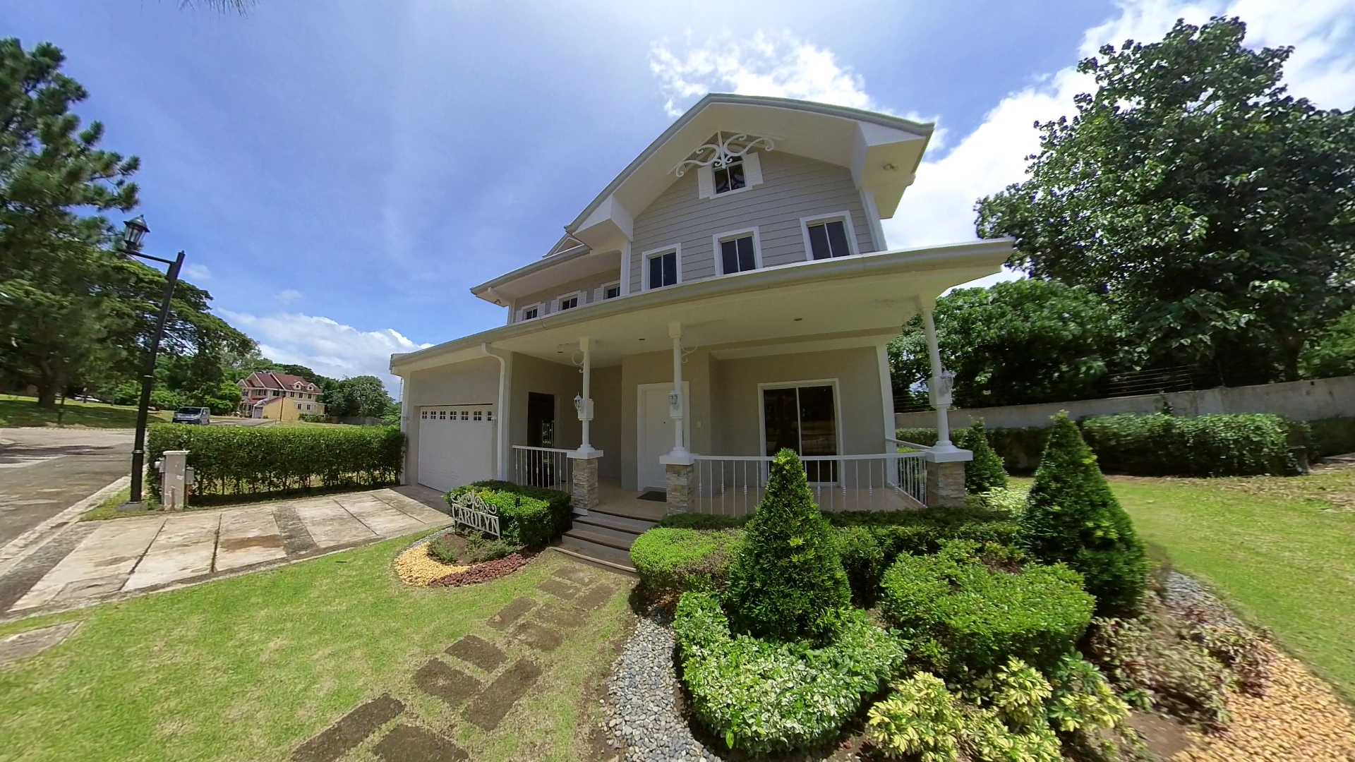
Luxury houses of the American classic style, like Carolyn and Lawrence in Promenade, are also matched with refined details of the old world, having full-height porches with grand columns of either Corinthian or Composite capitals, and a symmetrical facade. The quaint English mansions of Brittany are definitely a home standard for many ultra-rich and affluent people who value history.
Selecting Color Combinations for Your Room
The individual’s response and meaning to colors are primarily subjective. Every member of your family may not have the same feelings and feedback on hues. Hence, it is important to well-think about what shade to use in specific spaces in your home. To help you think through what hues to include, you may want to ask yourself first a couple of these questions:
-What purpose is the space for?
-What shade are you attracted to most?
-Are there colors that help you concentrate or invoke your feeling of calmness?
-What hues make you happy?
Your mental and emotional associations with certain colors can be impactful when put in the right spaces. For instance, if you intend a home space to be like an office, you will want to choose colors that will help you focus more. In spaces where you may spend more time, like the living room, you might want colors that promote happiness and create spaciousness. In bedrooms, you might prefer colors that can bring serenity and create feelings of calmness. Wherever it is, consider your needs for each room to guide you in your color choices.
Other Things to Consider:
As mentioned before, a color palette is not all about paint colors. Some factors can contribute to and support your luxury color palette in spaces. Things like lighting, wall decorations, and even your surroundings have to be considered as they can play a significant role in what the room will look like. Here are some things best to keep in mind:
1. Factor In Your Lighting Options.
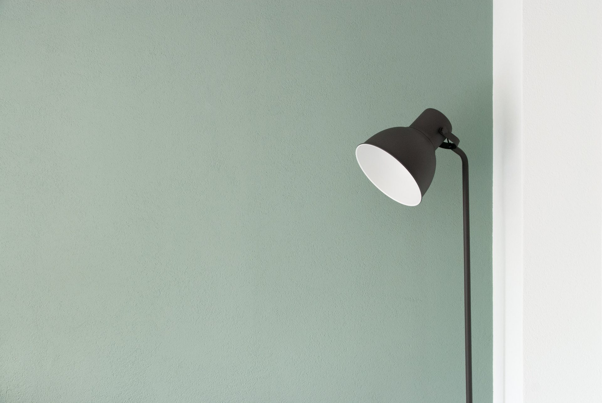
Lighting will undoubtedly change the way colors can influence your outlook and feelings. For instance, if you prefer bright light, your choice of color will surely stand out and shine more. Conversely, If you use warm lighting, your wall paint color will likely look more mellow. When choosing hues for a specific space, test the color with your current lighting to see what it would look like.
2. Use the decor elements.
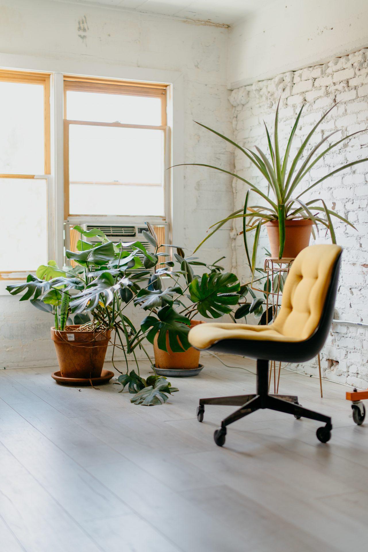
Understanding your style will give you an overall idea of what color to use to complement your home décor and furniture pieces. Use your decor as inspiration. When selecting your colors and decorative elements, make sure to add in your pillows, curtains, or sofa to see if there is harmony.
3. Include the outdoors.
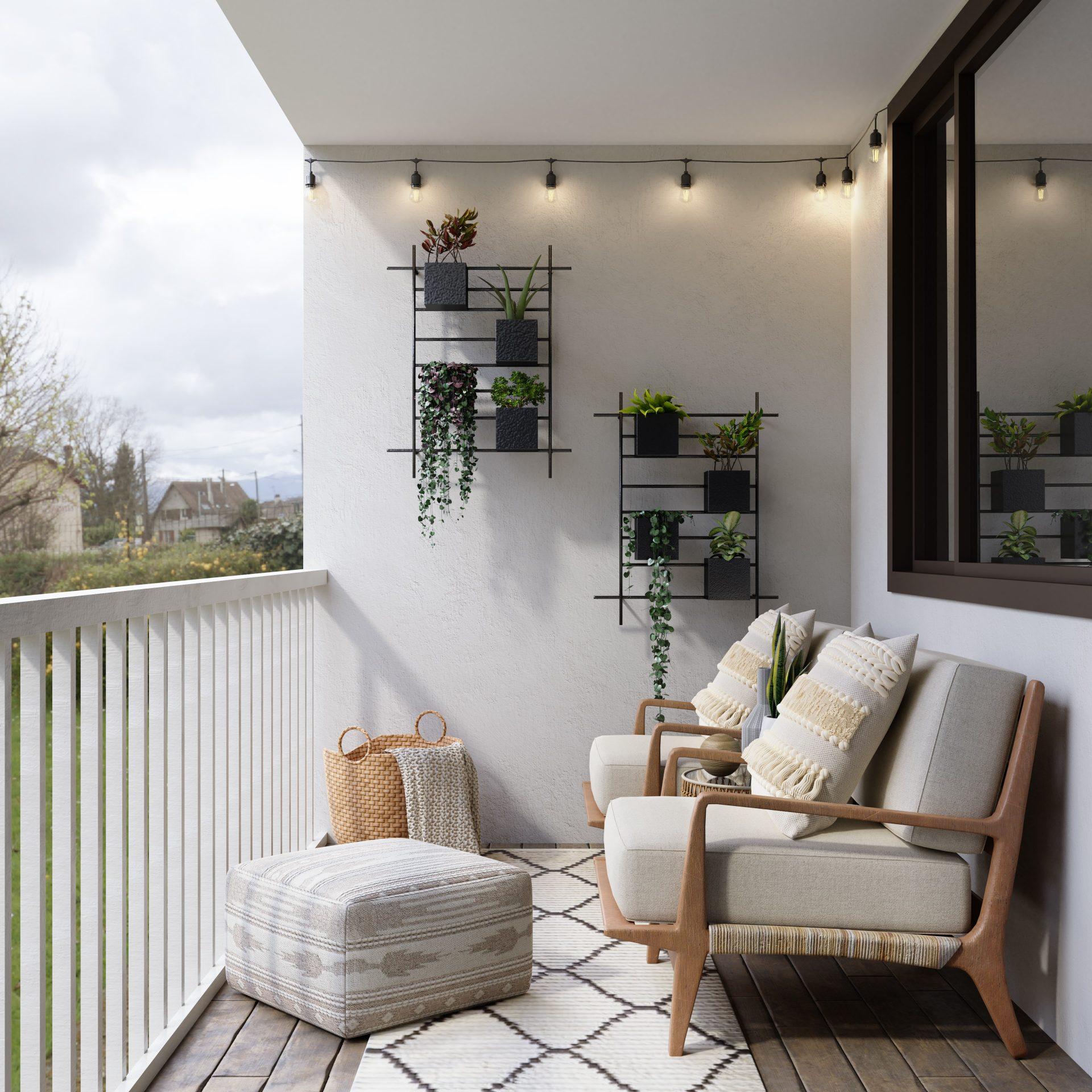
It may not appear so, but the outdoors can have an impact on your color palette. Look through your windows. Whatever color you see is prominent and arresting to the eye outside of your windows; dark green color in the garden, park, or navy blue color of ocean views, you can always bring that into your room space to make you feel surrounded by nature.
In Summary
Brittany’s luxury homes are top-notch luxury homes that certainly inspire your creativity. Whether you decide to stick to the paint finishes of your luxury home or get a stroke of your creative juices, keep the color scheme flowing. Bring the color of your room throughout your home so that you achieve cohesiveness. This will help keep your luxury color palette flowing and in harmony without being overly similar in every room.
Next Read: How Colors Affect Your Daily Life
Next Read: Are Paintings a good investment?