BLOGS
Paint Color Trends 2024 For House and Lot Properties
Colors play a massive role in our daily lives. When it comes to choosing a color to paint a house and lot property with, aesthetic is not the only factor being taken into consideration. It is said that the color people surround themselves with inherently affect their mood and serves as an expression of their personality—this explains why many personality tests include color choices as part of the questions.
This is why each year, color trend is one of the biggest items real estate professionals watch out for. Choosing the best shade to paint a house’s walls in can be a major factor that potential homebuyers take into consideration. After all, the property’s hue selection is one of the first things clients will first notice. It will not hurt—it will be advantageous, even—to listen to the consensus of major paint brands and check the hip hues selection for the coming year.
Cool Shades Are Cool
Cool shades, like blue, that instantly brings to mind the refreshing effect of being close to nature have always been a popular choice when it comes to house’s paint colors. closely connected to nature. In fact, blue is considered to be just one of those colors that will never lose its place in the yearly paint color trends due to its connection to nature.
For the year 2024, trend forecasters say that the shades of blue that will be mostly seen in the market are gearing towards the more airy and watery shades until the year 2025. These shades include bay blue, blue nova, punchy blue, and renew blue which will be great to create spaces that provide tranquility and a homey feel to its residents. It is not surprising because most people have this constant need to spend time in nature to recharge and improve their overall well-being. Cool shades provide serene and meditative vibe to one’s home.
Neutral Colors Hardly Go Wrong
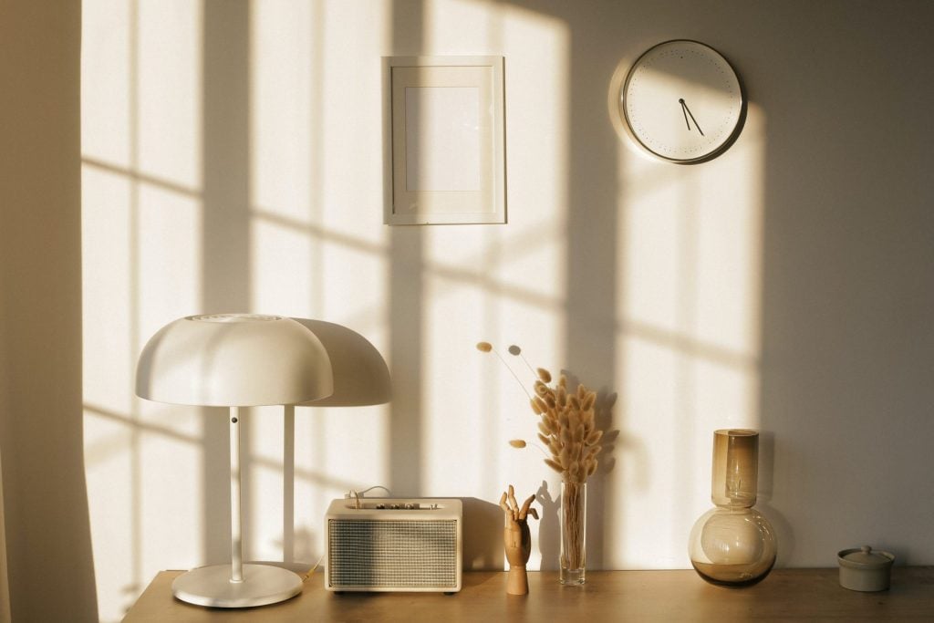
Neutral shades are all the rage this generation especially those who follow the minimalistic aesthetic in their homes. In recent years, warm neutrals and buttery tones have been some of the most popular paint colors that homeowners use as a solid color base for their properties.
When choosing a color palette for one’s home, one of the most essential considerations will be the overall effect the design will have on people—especially the ones who will spend the most time in it. Neutral shades have a peaceful and calming effect to people which is a huge contrast to life’s constant hustle and bustle. Coming home to a space that provides this vibe will really feel like it is always a time of relaxation, which is what every interior designer would love for a client to experience.
Neutral colors that can be seen with deep olive shade and natural wood colors have the ability to create a calm atmosphere simply because they do not compete with the rest of the elements and features of the space. In short, it is easy on the eye. It is also easy to experiment with more colors by combining neutral paint colors with gold, silver, or other metallic shades to add a modern touch to one’s home. This will help in expressing the homeowner’s personality or showcase variations by personalizing each space.
Aside from this, neutral shades easily help with the decoration process. Having a solid, lighthearted color base will help in the ease of introducing eye-catching elements in the space such as furniture, curtains, pillows, or rugs that will not feel heavy on one’s eyes. This gives the homeowners the opportunity to create unique pieces that stand out in their space without taking away from the overall feeling of peace and calm that a neutral color palette specialized on. This is the best choice for those who are having a hard time to choose which element to give the spotlight on inside their home.
Earth Tones Take Centerstage
If the homeowner’s desire is to make their own space give off a cozy and laid-back atmosphere, then using an earthy color palette in their home is the way to go. In the recent years, using a high contrast of colors such as a black-and-white moment or a loud tropical color scheme have been trend, but there is something that just screams classic and timeless when using earth tones.
The common misconception is that earthy tones are heavy on using the color green. However, there are a wide array of color combinations that can be used under earthy tones. From serene sage to gray undertones, these calming hues are perfect for those who wants a relaxing space but also detest using neutral shades. It is a good thing that design trends also re-introduced the beauty of the brown hues on many home elements and features which helped in bringing an appreciation to earthy tones again.
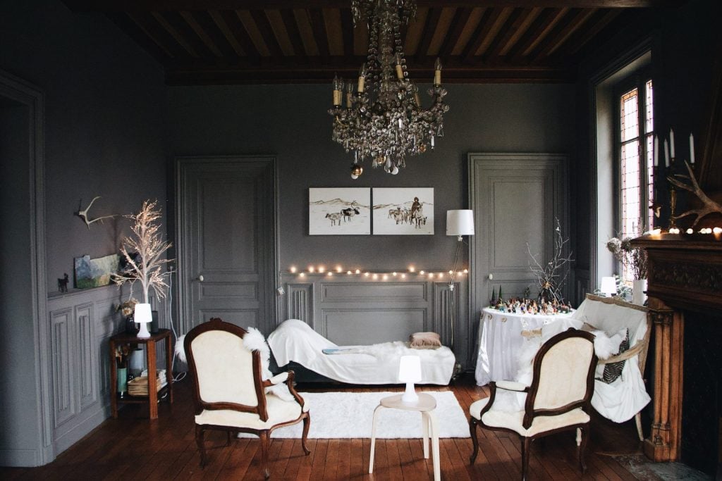
Gray paint color, a pretty earth tone, is not commonly used as a base for interior. It is because many think that it will only bring a gloomy atmosphere inside the home but clearly, people are missing out. With the right decorations, it will bring a distinct elegance to the space that can be difficult to achieve with other colors. The muted appearance of the charcoal, with the right addition of furniture in chocolate brown color is a timeless combo that will easily transform a space to exude extravagance.
For those who love the holidays, the Christmas hues can no longer be exclusive towards the end of the year. Deep red, green, and white can be a great color combination especially for those who are up for an experiment. These colors look good on Christmas decors because they are a proven and tested complementary colors that work beautifully together no matter the season is. Adding warm wood, tan, and luxurious brass accents will even more elevate the look.
Paint companies such as Benjamin Moore and Krylon’s color marketing manager share best practices in using earth tones. It is said that the secret to using grounded earth tones is adding contrast and depth with texture. Also, when working with the bolder earth tones, it is important to select one primary color and sprinkle it with complementary accents using different home decors and accessories.
Conclusion
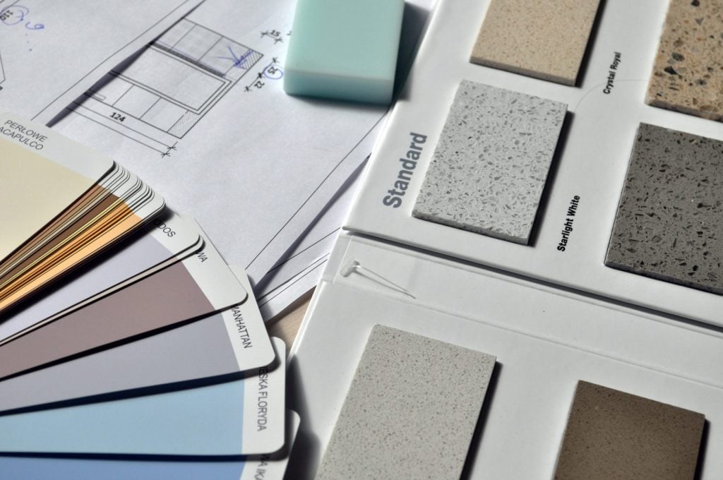
While waiting for the official 2024 color of the year, many paint companies have named theirs already to provide those who are planning to revamp their space an idea of the hip hues to use. Some of the top considerations to think of is the homeowner’s personality, ease of maintenance—since some colors might need regular maintenance than others—and the residents’ everyday lifestyle.
Not sure how to start your color selection process? While DIY home improvement projects have been the fad for some time now, it is always the best choice to to consult experts such interior designers to make sure that the vision homeowners have in mind will come to life with proper guidance on the right color combinations and accessories’ addition to the space.
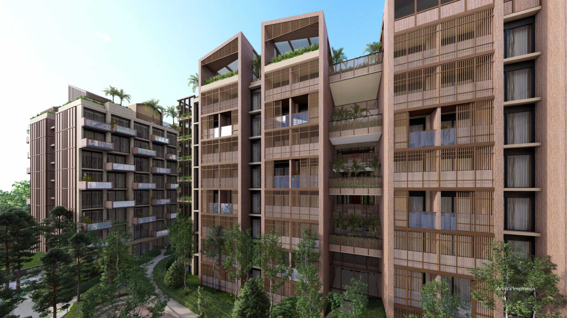
When it comes to experts on luxury house and lot for sale, Brittany Corporation has been one of the leading developers in the Philippines with an intensive portfolio of luxury residential properties in some of the country’s most prime locations. These Brittany locations are mostly situated near the metro to provide homeowners the best of both the urban and rural lifestyle.
One of Brittany’s luxury house and lot developments is Amore at Portofino which was recognized as the Best Housing Development in Manila and the Best Housing Development in the Philippines at the Philippines Property Awards in 2015. This lovely development is inspired by the charm and rustic appeal of Tuscany and is definitely worth the investment of future luxury homeowners.
Aside from the beautiful house and lot for sale, Amore at Portofino also boasts of its amenity center where residents can easily access and enjoy features such as a swimming pool, basketball court, community hall, and a meditation garden inside their own neighborhood.
Live your dream luxury life, be part of the Brittany Homes community! Check out their beautiful, world-class luxury residential properties by visiting their official website or following Brittany Corporation on their social media accounts for the latest updates on their luxury properties and upcoming developments in the Philippines.
Suggested Read: Subtle Elegance: Calming Neutral Interior Tones
Suggested Read: Color Trends for Your Italian-Inspired Home
Suggested Read: American Home Interior Design Trends
Suggested Read: Earth Day: Giving Back to the Earth
Suggested Read: 2023 Color of the Year Predictions