BLOGS
2023 Color Of The Year Predictions
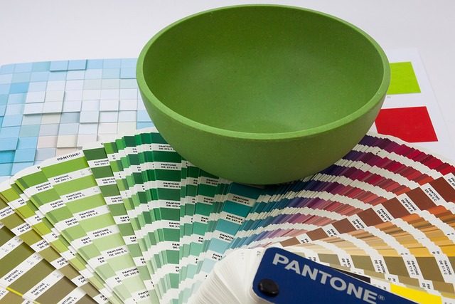
The color of the year is a forecast by Pantone, which provides professional-grade color-matching systems and consulting services. Pantone is responsible for identifying and naming each new annual Color of the Year as the global authority on color. They aim to inspire designers and consumers alike with their forecasts for upcoming seasons and offer guidance on how to use these colors in various applications. This article will give you an overview of the past color forecasts and provide insight into what we can expect from Pantone in the color of the year 2023.
What Are the Prediction Colors for 2023?

The color of your home in Bern Baguio can significantly impact how you feel about it. The color of your clothing can affect how others perceive you and even how you feel about yourself. Color has been used for centuries to enhance moods and promote healing.
What is the color of the future? Will we be living in an orange or yellow world? Or are green, blue, and purple going to take over?
The answer is that none of these color trends will dominate, but a combination of several colors will make up the world in 2023.
Benjamin Moore: Raspberry Blush
The Benjamin Moore color of the year is a combination of orange and red that’s sure to brighten up a room, but not in a harsh way. It’s the perfect hue for your luxury condo in Baguio if you want to create a warm, welcoming space that feels luxurious but not too feminine. This color is ideal for powder rooms because it makes people smile when they see it!
You can use this Benjamin Moore color of red-orange in any room of the home. It’s not overwhelming and is perfect for those who want to spice up their space without going overboard—it’s also great for adding pops of color to a neutral-toned room!
Glidden: Vining Ivy
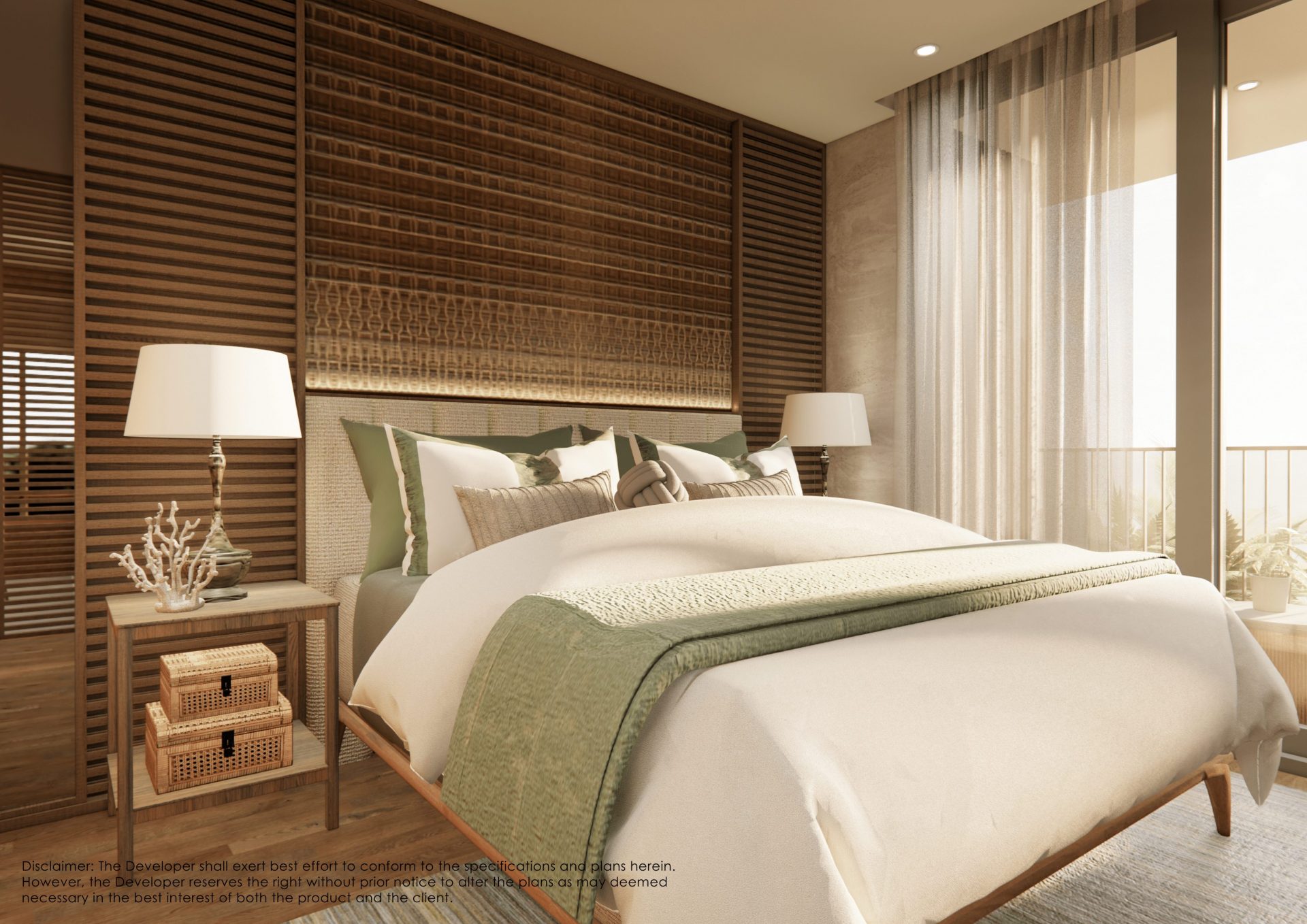
Vining Ivy is a beautiful blue-green shade that works well with any decor. It has an earthy look and feels that will make your space feel more calming and serene. This color is great for rooms in Bern where you want something more neutral than bright, but you also don’t want anything too dark or bland.
Additionally, it’s a great color to use in bedrooms because it’s relaxing and soothing. It’ll help you unwind after a long day at work and make it easier to fall asleep at night!
Sherwin-Williams: Redend Point
Redend Point is a warm shade of blush-beige that reflects the popularity of neutral colors. It’s a great color for those who want something more subtle than bright but want to add a bit of personality to their space. Redend Point is one of those colors that can go well with any other shade, making it the perfect addition to your home if you’re looking for something neutral that will work with just about anything.

Valspar: Everglade Deck
Everglade is a dark blue-green color leaning toward turquoise that will help you achieve a modern look in your home. It’s a great color to use when you want something different than your average blue but still want it to be a shade of blue. It’s also popular with those who love the sea and enjoy fishing, as Everglade is the perfect color that resembles the ocean’s depths.
It’s not too bright and not too dark, making it the perfect pair for other neutrals like white or black. If you want to add some personality (and color) to your space in your luxury condominium in Baguio without going overboard, this is what you need!
HGTV Home by Sherwin Williams: Darkroom
Darkroom, a deep black-purple shade, was selected as the brand’s 2023 Color of the Year. It makes sense that the color is named after something connected to film photography and nostalgia since it’s part of the Vintage Homestead Collection. This color is perfect for those looking for something dark and dramatic. It has just the right amount of purple, making it unique while still being neutral enough to go with anything in your home.
Behr: Blank Canvas
Behr chose Blank Canvas—a warm white hue—as its Color of the Year for 2023. The neutral backdrop of this color is perfect for highlighting any creative expression, but the warm undertone makes it pair exceptionally well with other soft earth tones. This is perfect for a minimalist home but versatile enough to be used in various spaces. You can use it as an accent wall or paint the entire room this beautiful shade.
What is the 2024 Color of the Year?
WGSN, a global authority on consumer and design trends, and Coloro, which helps companies predict future color preferences worldwide, have announced Apricot Crush as their predicted Color of the Year for 2024. The color is a modern interpretation of coral pink. It’s a warm, dusty tone evokes summer days and nights spent on the beach. This shade is perfect for brightening up any space, but it works well with a muted color like black or navy blue.
This is a great color to use in dining rooms and kitchens in Bern Baguio, as it will help create a vibrant atmosphere. You can also use Apricot Crush in living rooms and bedrooms for a touch of summery style. Also, the color is a great option for those who want to create a sense of warmth in their home. Apricot Crush provides just enough brightness to make you feel happy, but it’s not so overpowering that it can’t be used as an accent color.
Is Green the Color of 2022?

According to many designers, green is the color of 2022. Surprise, this shade is becoming a popular choice for interior decorators and homeowners alike. This color can give your home an earthy feel while infusing it with vibrant energy. Sue Wadden, from Sherwin-Williams, says that “green has become such a common hue, as people want to incorporate life and nature to their spaces.” We’ve seen a shift in trends away from bolder, jewel-toned colors and toward warmer, nature-inspired hues.
That said, just because 2022 is nearing an end, it’s not too late to incorporate greens into your interior design. Here are three ways to use green in your home:
1. Use it as an accent color
Green works well with neutral tones, so try painting a small accent wall or even just one room corner in a different shade of green. You can also paint a piece of furniture that stands out against the rest of your space in Bern Baguio. One of the easiest ways to incorporate green into your home is through plants. If you don’t have much space, try adding a few succulents or air plants, which are small but impactful.’
2. Use green as a neutral
If you want to bring green into your home but don’t want it to stand out too much, consider using it as a neutral color. You can use it in place of beige or white on walls or even use it as an accent color in your space. Try painting different shades of green on a wall and see how they all look together—this could lead you down a new design path that works well for your style!
3. Use plants as decor
If you’re looking for a way to bring a little green into your home, why not use plants as decor? Many plants are easy to care for, so this is an excellent option if you have little time or space. Mistakes with houseplants can happen—just remember that they’re still beautiful!
What Are the Decorating Trends for 2023?
Paint color is a big part of the decorating trends for 2023. This year’s trend is to use paint in unexpected ways—think walls that are completely covered in a single color or an entire room painted with stripes! Also, you can expect to see more browns and grays on the market this year. These colors are easy to pair with other hues and make great accents for your home.
For example, you could paint a room the same color as your walls and furniture in your luxury condo in Baguio, then add accents with brighter colors! There is also a strong trend toward white and light-colored walls. These are perfect for making a room feel bigger and brighter, so you can expect to see this color on many of the new paint colors for 2023!
Final Thoughts
To summarize this article, you should expect more neutral colors on the market. These are perfect for making a room feel bigger and brighter, so you can expect to see this color on many of the new paint colors of the year 2023! If you’re looking for something bolder, some bright colors will also be available this coming year.
Suggested Read: Add Color And Life To Your Living Room With Greens
Suggested Read: Subtle Elegance: Calming Neutral Interior Tones
Suggested Read: Color Trends For Your Italian Inspired Home
Suggested Read: Philippine Real Estate Predictions This Year
Suggested Read: 2022 Cryptocurrency Price Predictions


